In the first part of Getting to 85 – Agile Metrics with ActionableAgile we looked at the Cycle Time Scatterplot as generated by ActionableAgile software. That piece also discussed some ideas the scatter plot could bring about and conversations that potentially might occur.
Let’s take a look at another important chart and set of metrics the ActionableAgile can produce based on sample or custom loaded data – Cumulative Flow Diagram (CFD).
![]()
In a nutshell, CFD is a stacked area plot, with the time scale (usually days) displayed along the X-axis and the number of work items shown along the Y-axis. Here comes the first surprise for Scrum practitioners: we plot only the number of items in each category, stacking them on top of one another. Not their value, or the story points associated with an item. On the Y-axis, one item counts as one.
This immediately raises an argument that the chart might be seen as useless because we always deal with items of different sizes and complexity, items that require different efforts to complete. Kanban provides a simple response – it does not matter. Well, almost. It does not matter as long as items are right-sized – and this is the key to making this part of Agile metrics work.
Now, we enter into a chicken and egg discussion: what comes first, the estimation of work or getting work done and realizing its actual duration? In Scrum, we usually right-size our items, ensuring that they fit into a Sprint. Some might use story points to check their Sprint Backlog’s “what” part against the team’s capacity. Others might skip story pointing altogether, task backlog items, and estimate tasks in hours. Teams adopt many approaches to their estimations. I would argue it doesn’t matter much. If you right-size your Product Backlog Items (PBI) and achieve a shared understanding of the work, you are on the right track.
On the other side of the spectrum is the #NoEstimators camp (which annoys me since lately, this camp seems to have evolved into a #NoEverything camp, but that’s a story for another time). They argue that since estimations are usually quite inaccurate (and they mostly are) and too time-consuming for the results they produce, the estimation process itself is a gross waste of time.
CFD Agile Metrics for Estimation
Kanban offers a unique approach that is also beneficial for Scrum practitioners, especially those practicing Professional Scrum with Kanban. You begin with multiple items, each estimated to be completable within your Sprint duration or less. The estimation discussion could be as straightforward as asking, “Do we believe we can complete this Product Backlog Item (PBI) within this sprint?” If the answer is affirmative, the item is added to the Sprint Backlog, concluding the estimation phase. Next, work on these items and progress them across your board to completion.
When implemented correctly, with Work in Progress (WIP) limits, you’ll soon start gathering Cycle Time data. The data collection depends on the size of the items, the team’s capacity, and consequently, the team’s throughput. This data can provide enough information to calculate reasonably reliable percentiles, as discussed in the previous article.
Remember, percentiles enable us to add valuable probability data to the timeframe in which a team can complete an appropriately sized item. How is this data useful for Scrum teams? For instance, in the next Sprint planning, the team might consider adjusting its definition of the appropriate size for a PBI. Instead of a PBI fitting into a Sprint, it could be defined as a PBI that can be completed within a certain number of days with an 85% probability. This adjustment is useful provided it fits within your Sprint duration; otherwise, it could present a challenge.
There is an even better method Scrum teams could use estimating the number of items that could be completed within a Sprint to improve their agile metrics and make them more meaningful. That is the Monte Carlo simulation and that one I will reserve for another post. Back to the CFD for now.
CFD Numbers and What They Mean
Let’s examine a zoomed-in section of the diagram and discuss the numbers it presents. In the screenshot provided, there are four numbers. The vertical line labeled “20190119” indicates 35 items. This represents the number of items in progress on that specific day, which is quite straightforward. Simply count all the items on your board that fall between the “commitment” and “done” points to determine this number.

The horizontal line marked as 8 days is somewhat more complex. Should you find yourself in the same room with Dan Vacanti discussing metrics, I recommend, for your own safety, never to refer to that number as “Cycle Time.” He might jokingly threaten to unleash unconstitutional pain and suffering (he won’t, but let’s pretend he might, and avoid doing it).
Referring to this Agile metric as “Cycle Time” is incorrect for a simple reason. Consider how we construct this chart. Each day, we count the cards on the board between the commitment and done points, and mark corresponding numbers on the Y-axis. Over time, this creates nice colored areas.
Notice the dot next to the callout that reads 8 days (on the date 20190111). The team started some items on that day and completed others on 20190119. What we can’t ascertain is whether the completed items are the same ones that were started on 20190111. They might be, but most likely they are not. Unless you set your Work In Progress (WIP) Limit to 1 for the entire system (which is not the case in the example above), we cannot be certain.
The horizontal line and the 8 days label represent the Average Approximate Cycle Time. We average the data from some items that we know moved through the system in 8 days. We can deduce that, on average, an item completed on 20190119 took approximately 8 days to complete.
How does this compare with our 85% estimate? Quite favorably, in fact. The latter, if you recall, was 16 days. This means that an average item completed between 20190111 and 20190119 took less time than our 85% confidence estimate. This discrepancy should not undermine your trust in the data provided by the scatterplot discussed in the previous article on Agile metrics. While the Cumulative Flow Diagram (CFD) provides a snapshot in time, scatterplot derived percentiles are calculated using the entire dataset.
Lastly, let’s examine two more data points the CFD offers: arrival and departure rates, which are 3.16 and 3.63 items per day, respectively. During the time interval shown in the diagram, the team, on average, started 3.16 items per day and completed 3.63 items. This indicates that the work in progress between the earliest and latest data points decreased. The team was, on average, completing work faster than it was starting new work. Therefore, the lines representing arrival and departure rates are converging. This is not highly noticeable in the diagram since the difference between the arrival and departure rates is slight.
Are We Missing the Bigger Picture Here?
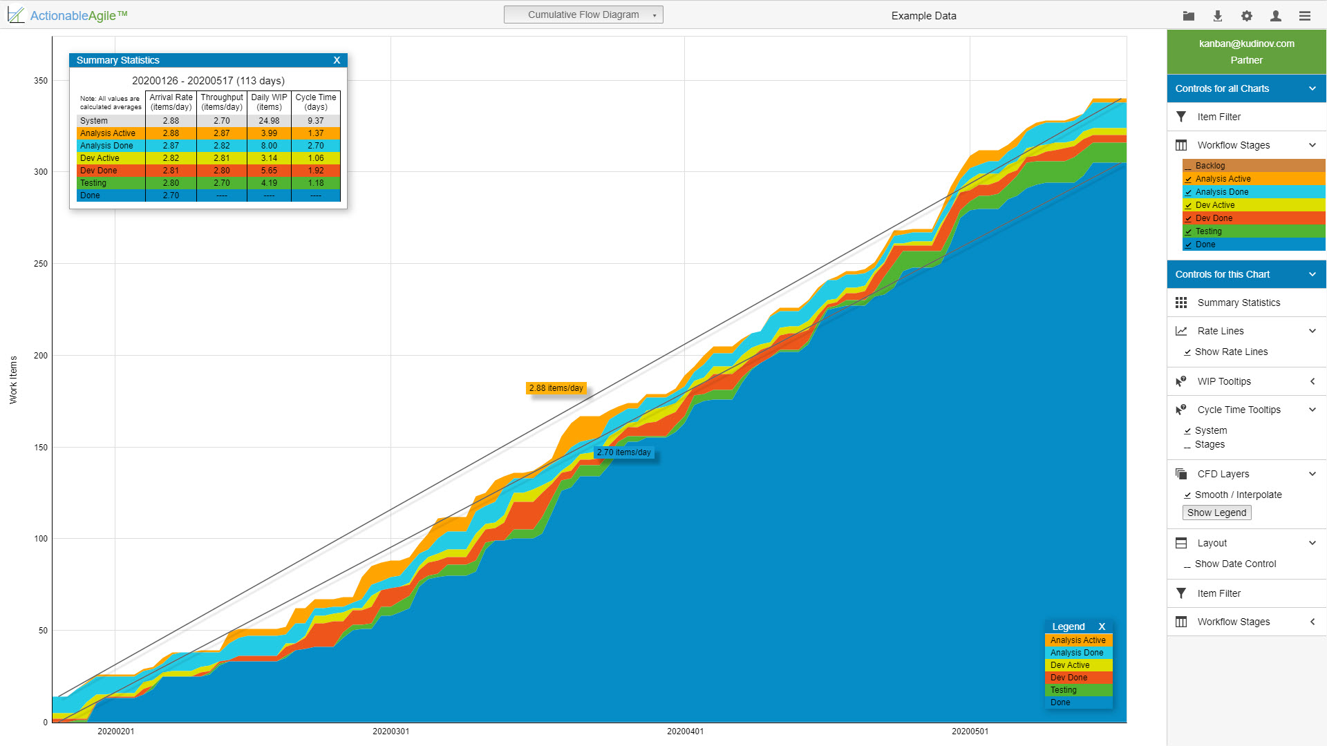
If we zoom out for a moment and examine the first screenshot, we will notice that the rates of arrival and departure stood at 2.70 items/day and 2.88 items per day, respectively. The lines representing arrival and departure are diverging quite significantly.
This observation suggests a few insights about the system. First, it indicates that the team’s Work in Progress (WIP) is increasing. Second, it suggests that the system is not in a stable state—indicating ongoing issues. If I were to hypothesize, I would suggest that some items are moving through the system faster than others, and the assumptions of Little’s Law might not apply (for those interested in Little’s Law and its assumptions, I recommend reading Dan’s book, which has been referred to as a comprehensive treatise on the subject).
ActionableAgile offers a feature to delve deeper into the data, allowing examination of your WIP and approximate average Cycle Time by stage, as illustrated in the screenshot. This could be an opportunity to address inefficiencies, akin to the concept of Muda in waste reduction. For instance, the ‘Analysis Done’ stage took 2 days, which is twice the duration of the ‘Analysis’ stage. The work awaited testing for a day, which was equal to the time taken for the actual development. Are there opportunities for improvement here? I believe there are.
I was thinking of covering the Aging Work in Progress chart in this post as well, but the post became quite long already. In the next post, I will discuss the Aging Work In Progress metric and its corresponding chart.